

Box Shadow Generator
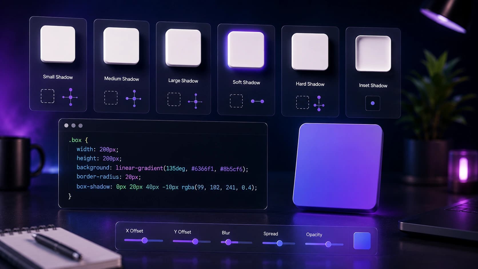
Adjust blur, spread, offset, and color on a live preview box, then copy the CSS box-shadow value directly into your stylesheet.
Preview card
Presets
CSS output
box-shadow: 0px 8px 24px -4px rgba(0, 0, 0, 0.15);
Live-previews one or more shadow layers as you adjust parameters, and outputs a single CSS declaration ready to paste.
Stack multiple shadows for richer, more realistic depth.
Soft, medium, and strong starting points to build from.
One complete declaration ready for your stylesheet.
Subtle 0 4px 20px rgba shadow for gentle elevation.
Stronger shadow that increases on hover state.
Adjust offsets, blur, and spread with sliders.
Add a second shadow layer for more realistic depth.
Copy the CSS declaration.
Test on real content at the intended size.
Card and button elevation without guessing values.
Build a consistent depth system across a design.
See exactly how each parameter changes the visual result.
The shadow generator runs entirely in your browser. No CSS values, colors, or configuration data are sent to Sounez servers or stored anywhere.
Avoid applying complex multi-layer box-shadow values to long scrolling lists or grids with hundreds of items — this can significantly reduce rendering performance on lower-end devices. For large repeated components, consider simpler borders or background differences instead.
Yes — toggle the inset option to create a shadow that appears inside the element rather than outside it. Inset shadows are useful for pressed button states, focused input fields, and inner glow effects.
Yes — map the generated CSS values to Tailwind's shadow utilities, or add them as custom shadow values in your tailwind.config.js under extend.boxShadow. You can then use them as utility classes.
Yes — add multiple shadow layers in the generator and copy a single CSS declaration that includes all of them comma-separated. Layering a tight shadow and a diffuse shadow creates more realistic depth than a single shadow.
A few tools that naturally pair with Box Shadow Generator.
Pick two colors, set an angle, and copy the CSS gradient code straight into your project.
Open toolGenerate a five-color palette in one click. Tap any swatch to copy the hex code.
Open toolCreate CSS and SVG background patterns for websites, landing pages and UI mockups.
Open toolPractical guides and how-tos from the Sounez blog.
Adjust blur, spread, offset, and color on a live preview box, then copy the CSS box-shadow value directly into your stylesheet.
Presets
CSS output
box-shadow: 0px 8px 24px -4px rgba(0, 0, 0, 0.15);