CSS Box Shadow Guide: How to Create Better Shadows
Shadows are one of the most powerful tools in UI design. Used well, they create depth, establish visual hierarchy and make interfaces feel tangible. Used poorly, they make designs look dated, heavy or amateurish.
This guide covers the CSS box-shadow syntax, the difference between soft and strong shadows, practical UI examples, accessibility considerations and how to use the Box Shadow Generator to design shadows visually.
What is box-shadow in CSS?
The box-shadow property adds one or more shadow effects around an element's frame. It does not affect layout, it is purely visual.
Box-shadow syntax explained
box-shadow: [inset] <offset-x> <offset-y> <blur-radius> <spread-radius> <color>;- inset (optional), Makes the shadow appear inside the element.
- offset-x: Horizontal offset. Positive moves right, negative moves left.
- offset-y: Vertical offset. Positive moves down, negative moves up.
- blur-radius: How blurry the shadow is. 0 = sharp edge. Higher = softer.
- spread-radius: Expands or contracts the shadow. Negative values shrink it.
- color: The shadow color. Use rgba() for transparency control.
Common examples
/* Soft card shadow */
box-shadow: 0 4px 24px -4px rgba(0, 0, 0, 0.12);

/* Medium elevation */
box-shadow: 0 8px 32px -4px rgba(0, 0, 0, 0.18);

/* Sharp drop shadow */
box-shadow: 4px 4px 0 0 rgba(0, 0, 0, 0.25);

/* Inner shadow (pressed state) */
box-shadow: inset 0 2px 8px rgba(0, 0, 0, 0.15);

/* Multiple shadows */
box-shadow: 0 2px 8px rgba(0,0,0,0.08), 0 8px 32px rgba(0,0,0,0.06);
The best shadows are the ones you barely notice. Subtlety is the mark of a polished UI.
Soft shadows vs strong shadows
Soft shadows (modern, minimal)
Soft shadows use a large blur radius, negative spread and low opacity. They create a sense of gentle elevation without drawing attention to themselves. This is the dominant style in modern UI design.
box-shadow: 0 4px 24px -4px rgba(0, 0, 0, 0.10);Strong shadows (dramatic, retro)
Strong shadows use a small blur radius, high opacity and sometimes a colored shadow. They create a bold, graphic effect. Common in retro-inspired designs and neo-brutalism.
box-shadow: 4px 4px 0 0 #000000;UI examples: where to use shadows
- Cards: A soft shadow lifts the card off the background, making it feel interactive.
- Buttons: A subtle shadow on a primary button adds depth and makes it feel pressable.
- Modals and dropdowns: A larger shadow creates the illusion of the element floating above the page.
- Input fields: An inset shadow on a focused input creates a subtle pressed effect.
- Navigation bars: A thin bottom shadow separates the nav from the page content.
Colored shadows: when and how to use them
Most shadows use rgba(0, 0, 0, ...) — black at low opacity. But colored shadows can add personality and reinforce brand identity when used carefully. Common uses:
- Brand-colored glow: A purple or blue shadow on a primary button creates a glow effect that feels on-brand. Use the brand color at 20-30% opacity.
/* Brand glow on hover */ box-shadow: 0 8px 32px rgba(99, 102, 241, 0.35); - Warm vs cool shadows: Instead of neutral black, try a warm brown for warm-toned designs or a cool dark blue for tech-focused products.
- Neo-brutalism accent shadows: A bold colored shadow offset to the right and bottom (with no blur) creates the signature "sticker" effect popular in neo-brutalist design.
/* Neo-brutalism colored shadow */
box-shadow: 4px 4px 0 0 #7C3AED;
Avoid colored shadows on text elements. Colored glows work on interactive elements (buttons, cards) but reduce text legibility when applied to type.
Animating box-shadow for interactive states
Shadows work especially well as hover state transitions. A card that lifts on hover, or a button that deepens when pressed, adds a tactile feel to flat interfaces.
.card {
  box-shadow: 0 2px 8px rgba(0, 0, 0, 0.08);
  transition: box-shadow 0.2s ease, transform 0.2s ease;
}

.card:hover {
  box-shadow: 0 8px 32px rgba(0, 0, 0, 0.14);
  transform: translateY(-2px);
}

/* Button pressed state */
.button:active {
  box-shadow: inset 0 2px 6px rgba(0, 0, 0, 0.18);
  transform: translateY(1px);
}
Keep transition duration between 150ms and 250ms for shadows. Faster feels snappy on hover; slower feels sluggish. The ease timing function is typically better thanlinear for shadow transitions.
Accessibility and readability tips
- Do not rely on shadows alone for contrast: Users with visual impairments or high-contrast mode may not see shadows. Use borders or background color differences as well.
- Avoid colored shadows on text: Colored shadows on text can reduce readability. Use them only on decorative elements.
- Test in dark mode: Shadows that look great on white backgrounds can disappear or look wrong on dark backgrounds. Use lighter shadow colors in dark mode.
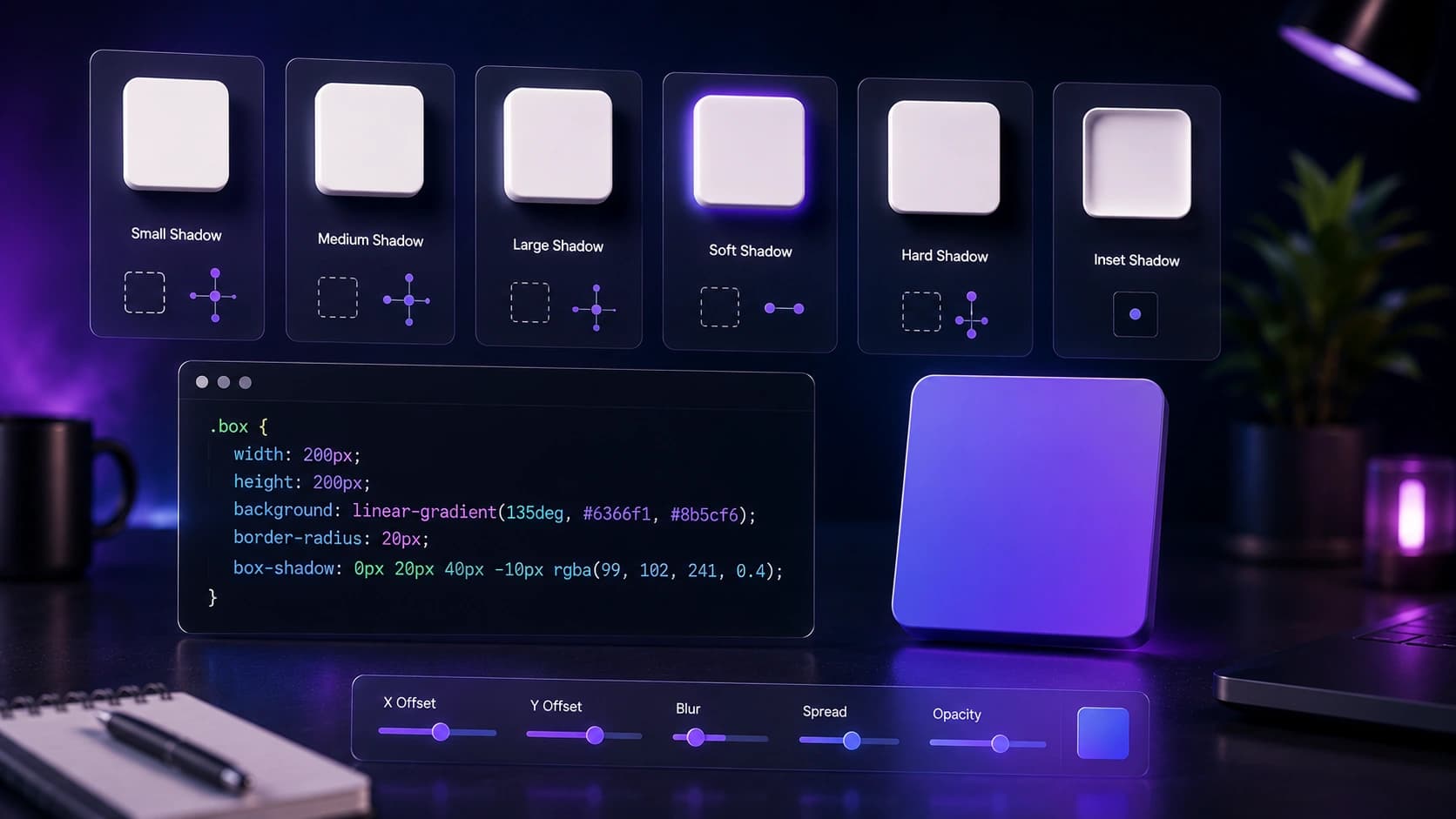
How to use the Box Shadow Generator
- Open the Box Shadow Generator.
- Start with a preset (Soft, Medium, Large, Sharp or Inner) to get a good starting point.
- Adjust the sliders: horizontal offset, vertical offset, blur radius, spread radius and opacity.
- Change the shadow color and background color to match your design.
- Enable Inset to create an inner shadow effect.
- Copy the generated CSS and paste it into your stylesheet.
Frequently Asked Questions
What is the CSS box-shadow property?
box-shadow adds one or more shadow effects around an element's frame. It accepts horizontal offset, vertical offset, blur radius, spread radius, color and an optional inset keyword.
Can I add multiple shadows to one element?
Yes. Separate multiple shadow values with commas. Layering two shadows (one tight, one diffuse) creates a more realistic depth effect.
What is an inset shadow?
An inset shadow appears inside the element rather than outside. It is useful for pressed button effects, inner glow effects and depth on input fields.
Does box-shadow affect layout?
No. box-shadow does not affect the layout or size of the element. It is purely visual.
Is the Box Shadow Generator free?
Yes. The Sounez Box Shadow Generator is free to use and does not require an account.
How do I create a shadow that looks good in dark mode?
In dark mode, black shadows often disappear against dark backgrounds. Use lighter shadow colors or increase blur radius. A brand-colored shadow at low opacity can also work well on dark surfaces.
What is the difference between box-shadow and drop-shadow filter?
box-shadow applies to the element's rectangular box. The CSS filter drop-shadow() follows the actual shape of the element including transparent areas — useful for PNG images and SVGs where you want the shadow to follow the visual shape, not the bounding box.
Conclusion: subtle depth, big impact
The best shadows are the ones users feel rather than see. They create depth and hierarchy without drawing attention to themselves. Open the Box Shadow Generator, start with the Soft preset, and adjust until it feels right. For the full design toolkit, pair it with the CSS Gradient Generator and the Color Palette Generator.
Found this article useful?
Written by
Nesou is a web developer and independent creator who built Sounez from scratch in 2024. The site covers practical browser tools for image editing, CSS design, social media publishing, file conversion, and everyday productivity — all written and maintained by a single developer with a focus on privacy-first, account-free tooling. About Sounez · GitHub
Ready to put this into action?
Open Box Shadow Generator and try it now. Free, no account needed.