The Complete Guide to CSS Gradients

CSS gradients have come a long way. What used to require Photoshop exports and heavy image files is now a single line of CSS that renders crisply at any resolution, loads instantly, and scales to any screen size. There's no reason to use a gradient image when CSS can do it better.
This guide covers every gradient type, the properties that matter, and the patterns that look great in real products, plus the free tool that generates them without writing a line of code.
The three types of CSS gradients
1. Linear gradients
The most common type. Color transitions along a straight line at any angle. The direction can be expressed as a keyword or a degree value.
/* Two-color diagonal */
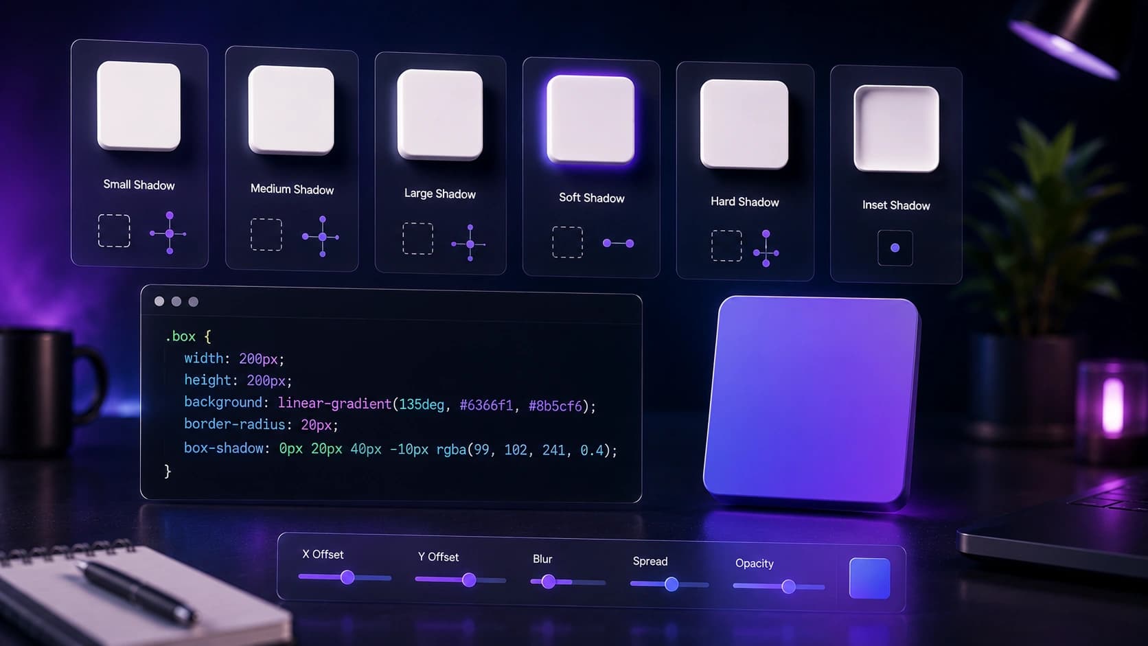
background: linear-gradient(135deg, #6366f1, #8b5cf6);
/* Three stops: add a midpoint color */
background: linear-gradient(to right, #0ea5e9, #6366f1, #8b5cf6);
/* Using percentage stops to control where color changes */
background: linear-gradient(to bottom, #ffffff 0%, #f1f5f9 60%, #e2e8f0 100%);The angle 0deg points up, 90deg points right, and135deg points diagonally down-right. Keyword equivalents like to right or to bottom right are more readable and mean the same thing.
2. Radial gradients
Color radiates outward from a center point. Great for spotlight effects, depth on card backgrounds, and soft glows behind hero content.
/* Centered circle glow */
background: radial-gradient(circle at center, #6366f1 0%, transparent 70%);

/* Off-center ellipse for dramatic lighting */
background: radial-gradient(ellipse at 30% 40%, #0ea5e9, #1e293b);

/* Subtle card depth — very low opacity center */
background: radial-gradient(ellipse at 50% 0%, rgba(99,102,241,0.15), transparent 70%);
Positioning the center with at x y lets you push the glow to a corner or edge, which works well for dark-mode cards and hero sections where you want depth without a heavy background image.
3. Conic gradients
Color transitions around a center point like a clock face. Newer and underused, but excellent for progress rings, pie-chart-style data visualization, and abstract decorative elements.
/* Basic color wheel sweep */
background: conic-gradient(from 0deg, #6366f1, #8b5cf6, #ec4899, #6366f1);

/* Two-color pie segment (50% each) */
background: conic-gradient(#6366f1 180deg, #e2e8f0 180deg);

/* Progress ring at 65% */
background: conic-gradient(#6366f1 65%, #e2e8f0 65%);
The progress ring pattern is particularly practical: set border-radius: 50% and a fixed width and height to turn any element into a circular progress indicator with no SVG or JavaScript. Check the latest support details on MDN Web Docs.
A CSS gradient loads in zero milliseconds and scales to any resolution. There's no reason to use a gradient image.
Gradient patterns that work in real products
The hero background gradient
A subtle, large radial gradient behind your hero section adds depth without distraction. Keep it low opacity (10–20%) and use your brand color so it feels intentional rather than decorative. Pair it with a white or near-white background so text contrast is never at risk.
/* Hero section with radial glow */
.hero {
  background:
    radial-gradient(ellipse 80% 50% at 50% -10%, rgba(99,102,241,0.18), transparent),
    #ffffff;
}
The brand gradient on CTAs
A diagonal linear gradient on your primary button makes it feel premium and distinct. The key is choosing two adjacent hues — blue to violet, orange to pink — rather than jumping across the color wheel, which creates a muddy middle.
/* Primary CTA button */
.btn-primary {
  background: linear-gradient(135deg, #6366f1, #8b5cf6);
  color: #ffffff;
  border: none;
}
.btn-primary:hover {
  background: linear-gradient(135deg, #4f46e5, #7c3aed);
}
The text gradient
Apply a gradient to text with background-clip: text. This technique works in all modern browsers and creates a striking headline effect. Use it on one heading per page maximum — applied everywhere it loses its impact entirely.
/* Gradient headline text */
.gradient-heading {
  background: linear-gradient(135deg, #6366f1, #ec4899);
  -webkit-background-clip: text;
  background-clip: text;
  color: transparent;
  display: inline-block; /* Required for background-clip to work on inline elements */
}
The card border gradient
Use a gradient on a pseudo-element to create a glowing border effect. The technique uses ::before with mask-composite: exclude to reveal only the border area of the gradient.
/* Gradient border using ::before */
.gradient-card {
  position: relative;
  border-radius: 1rem;
  background: #ffffff;
}
.gradient-card::before {
  content: '';
  position: absolute;
  inset: -1px;
  border-radius: inherit;
  background: linear-gradient(135deg, #6366f1, #8b5cf6);
  z-index: -1;
}
Common mistakes to avoid
- Too many colors: gradients with more than 3 stops usually look muddy. Two colors, one transition.
- Jumping across the color wheel: blue to orange creates a gray, muddy middle. Stay within 60-90° of the color wheel for clean transitions.
- Gradients everywhere: one signature gradient per UI. More than that and nothing feels special.
- Ignoring dark mode: gradients that look great in light mode can look garish in dark mode. Test both.
Build gradients without writing code
Use the CSS Gradient Generator to build any gradient visually and copy the ready-to-use CSS. Adjust angle, colors, stops and opacity with a live preview. No design tool, no guesswork. Pair it with the Color Palette Generator to pick colors that work together before building the gradient.
Performance: gradients vs. images
CSS gradients are rendered by the GPU and have zero file size. A gradient image (even compressed) adds HTTP requests and bytes. Always prefer CSS gradients for backgrounds, overlays and decorative elements. Only use images when the gradient is photographic or extremely complex. If you do need a gradient image, compress it with the Image Compressor first.
Frequently Asked Questions
Are CSS gradients supported in all browsers?
Linear and radial gradients have had universal support since 2013. Conic gradients are supported in all modern browsers (Chrome 69+, Firefox 83+, Safari 12.1+). No prefixes needed.
Can I animate CSS gradients?
Not directly with transition, browsers can't interpolate between gradient values. The workaround is to animate background-position on an oversized gradient, or use @keyframes with opacity transitions between layered gradients.
What's the difference between a gradient and a mesh gradient?
A mesh gradient has multiple color points that blend in 2D space, more like a painted surface than a directional transition. Pure CSS mesh gradients aren't possible yet; they require SVG or canvas. For most UI use cases, a well-crafted radial gradient achieves a similar effect.
How do I apply a gradient to text in CSS?
Set background to your gradient, add -webkit-background-clip: text and background-clip: text, then set color: transparent. The gradient shows through the text shape. Use it on one headline per page for maximum impact.
How many color stops should a gradient have?
Two stops is almost always enough for a clean result. Three stops work well for more complex transitions. More than three usually creates a muddy, cluttered look unless you are deliberately building a spectrum effect.
Should gradients be different in dark mode?
Yes. A vibrant gradient that looks polished on white can look garish on a dark background. In dark mode, reduce opacity using rgba values, or shift to darker, more muted tones. Always test both modes before shipping.
Conclusion: one gradient, used with intent
Pick one signature gradient for your brand, apply it consistently to your primary CTA and hero section, and leave everything else neutral. Open the CSS Gradient Generator now and build yours. It takes under a minute and the CSS is ready to paste.
Found this article useful?
Written by
Nesou is a web developer and independent creator who built Sounez from scratch in 2024. The site covers practical browser tools for image editing, CSS design, social media publishing, file conversion, and everyday productivity — all written and maintained by a single developer with a focus on privacy-first, account-free tooling. About Sounez · GitHub
Ready to put this into action?
Open CSS Gradient Generator and try it now. Free, no account needed.