How to Choose Font Pairings for a Website
Most websites use two fonts: one for headings, one for body text. The combination you choose affects readability, brand perception and how professional your site feels. A mismatched pairing can make even a well-designed layout feel off. A great pairing makes everything feel intentional.
This guide covers the principles behind good font pairings, serif vs sans-serif combinations, practical examples, performance tips and how to use the Font Pairing Tool to find the right combination for your project.
Why typography matters
Typography is not just about aesthetics. It directly affects how long people stay on your page. Poor typography, low contrast, cramped line spacing, mismatched fonts, increases cognitive load and causes readers to leave. Good typography is invisible: readers absorb the content without noticing the design.
According to Google Fonts' typography guidance, the most effective pairings create contrast through weight, style or classification while maintaining a shared visual quality that ties them together.
Good typography is invisible. Bad typography is all you can see.
Font pairing principles
1. Create contrast
The heading and body fonts should feel different enough to create clear visual hierarchy. Pairing two similar fonts (two geometric sans-serifs, for example) creates confusion rather than hierarchy.
2. Maintain harmony
Contrast does not mean clash. The fonts should share some quality, similar proportions, a shared historical period, or a complementary mood. A playful display font paired with a formal serif creates tension rather than harmony.
3. Prioritize readability for body text
Your heading font can be expressive and distinctive. Your body font must be readable at small sizes, in long paragraphs, on all screen types. Prioritize legibility over personality for body text.
4. Limit to two fonts
Two fonts cover 95% of use cases. A third font can be used for UI elements or accents, but every additional font adds HTTP requests, increases cognitive load and risks visual inconsistency.
Serif vs sans-serif combinations
Sans-serif heading + serif body
A clean, modern heading font paired with a warm, readable serif body. Works well for editorial sites, blogs and content-heavy pages.
- DM Sans + Fraunces, editorial, modern
- Space Grotesk + Lora, startup, approachable
- Manrope + Roboto Slab, clean, professional
Serif heading + sans-serif body
A distinctive serif heading creates elegance and authority. A clean sans-serif body ensures readability. Works well for luxury brands, agencies and professional services.
- Playfair Display + Inter, elegant, timeless
- Cormorant Garamond + Lato, refined, editorial
Sans-serif heading + sans-serif body
Both fonts are sans-serif, but with different weights, widths or personalities. Works well for tech products, SaaS and modern apps.
- Montserrat + Open Sans, clean, versatile
- Poppins + Inter, friendly, modern
Font pairing examples by project type
- Blog / editorial: Playfair Display + Inter
- SaaS / tech product: Space Grotesk + Inter
- Agency / portfolio: DM Sans + Fraunces
- E-commerce: Montserrat + Merriweather
- Personal brand: Poppins + Lora
- News / magazine: Oswald + Open Sans
Performance tips when using web fonts
- Load only the weights you need: Each font weight is a separate file. Loading 400 and 700 is usually enough.
- Use font-display: swap: Prevents invisible text while the font loads. Add
display=swapto your Google Fonts URL. - Preconnect to Google Fonts: Add
<link rel="preconnect" href="https://fonts.googleapis.com">to your<head>. - Consider self-hosting: Download fonts and serve them from your own domain for the best performance and privacy.
- Subset fonts: If your site is in English only, load the Latin subset to reduce file size.
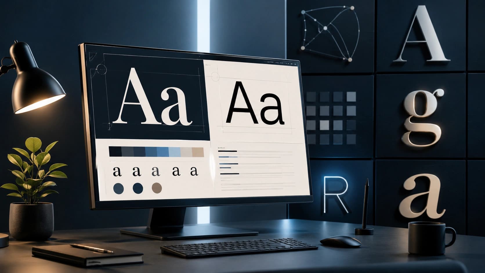
How to use the Font Pairing Tool
- Open the Font Pairing Tool.
- Choose a design style: Modern, Elegant, Startup, Editorial, Minimal or Playful.
- The tool shows a live preview with a heading sample, body text and UI elements.
- Click Next pairing to cycle through curated combinations for that style.
- Copy the CSS snippet and paste it into your stylesheet.
- Load the fonts from Google Fonts using the link provided.
Frequently Asked Questions
What makes a good font pairing?
A good pairing creates contrast between the heading and body font while maintaining visual harmony. The most reliable approach is to pair a distinctive heading font with a highly readable body font.
Should I use serif or sans-serif for body text?
Both work well on screens. Sans-serif fonts are slightly easier to read at small sizes. Serif fonts add elegance and work well for editorial and blog content.
How many fonts should a website use?
Two is the standard. One for headings, one for body text. More than three creates visual noise.
Are Google Fonts free to use commercially?
Yes. All fonts on Google Fonts are open-source and free to use in personal and commercial projects.
How do I load Google Fonts without slowing my site?
Load only the weights you need, use font-display: swap, and consider self-hosting fonts for the best performance.
Conclusion: contrast, harmony, readability
The best font pairings are the ones you stop noticing because the content flows so naturally. Use the Font Pairing Tool to find a combination that fits your project's style, copy the CSS, and load the fonts from Google Fonts. For the rest of your design system, the Color Palette Generator and CSS Gradient Generator cover colors and backgrounds.
Found this article useful?
Written by
Nesou is a web developer and independent creator who built Sounez from scratch in 2024. The site covers practical browser tools for image editing, CSS design, social media publishing, file conversion, and everyday productivity — all written and maintained by a single developer with a focus on privacy-first, account-free tooling. About Sounez · GitHub
Ready to put this into action?
Open Font Pairing Tool and try it now. Free, no account needed.